Deconstructivism is the opposite of what graphic designers have been doing or have been taught to do. Instead of letting the image completing the story for the words, the words tell the story for the image. Deconstructive artist want the words to be more powerful than the image. Jacques Derrida believes that words have been treated as merely a code, using them is just a behavior and the behavior alters the meaning. This is very true. A whole new meaning can be presented just by the placement or even the 'emphasise' of words. Words can be easily misunderstood.
In design, normally we read a design by seeing the image then reading the text. This is not the case in deconstructivism. First we see the text, then we read the image. Grammotography is what Derrida called the study of writing. He began to question language itself. As technology started to advance, type was becoming digital. A handful of designers wanted to cope with the changes in technology and rebel against it. Ed Fella, was just one of the few who continued to design the old-fashion way by finding or creating handwritten type.
Designers will always be trying to find away to reawaken the mind of the viewer. It seems to be getting harder to communicate something new, because it seems like what could be designed has been designed. I don't believe this is the case, but no new ideas pop in my head either. Designers of the 21st century are going to be pushed mentally and physically to send new messages to the world. In an age of rapidly advancing technology designers are going to have a harder time keeping up. We live in an age where we are turning to a machine (the computer and internet), instead of our peers, for answers. We now live in an age where designers have to work harder to spark a feeling or emotion in society. Like past graphic designers have done, what is it going to take for us to make the world stop again?
Monday, April 27, 2009
Monday, April 20, 2009
Post Modernism Design
There was a brief video on Post Modernism. It discussed how graphic designers thought that the industrial era could help build better buildings. This helped the Post Modernism movement create architectures that were fun, colorful and broke the traditional designs of buildings. They were a movement that was looking to create things that were instantly economical. They liked to mix architectural materials and designing to better fit their democratic freedom of expression. By this time photography became the ultimate tool because it helped create originality.
Graphic designers in the Post Modernism movement started using the distinctions in cultures and challenged them as well as politics. Their designing started to appeal to the younger crowd and the "Me" generation. Graphic comic novels and adult literature started to appear as the people started to find new ways of publishing. One of the first graphic designers to use a computer for this work was Wolfgang Weingart. He started to experiment with making his designs appear nonfunctional and disorganized, questioning the etiquette of typography. With that, along came the New Wave Typography. This movement featured designs with wider letter spacing, diagonal type, mixed typefaces and weight changes.
Finally people started to really study the history of art and design, putting it back in motion. This is very significant to me as I work for a company that issues a catalog that have the appearance and personality of the retro eras featuring everything from the 40's up to the 90's. Every time I think a new trend is style is coming around I seemed to always be reassured that it's already been in style before. I guess history will always be repeating itself.
Friday, April 17, 2009
". . . if it were not designed . . ."
• Reading + writing = literacy, reckoning + figuring = numeracy, wroughting + wrighting = the creation of making things (no word of it's own)
• At one time back in the 1950's there was an effort to introduce the term Techics but the only word currently in use is Design.
• The habit of calling a finished product a design is convenient but wrong. Design is something we do, not what we have done.
• Design is what happens between conceiving an idea and fashioning the means to carry it out.
• Designing is what goes on in order to arrive at an intelligent equation between purpose and construction, thus converting a problem into an opportunity.
• "Design is important because if it were not designed it would not be made."
• Designers are the blue-collar workers of the art world.
• Painters solve their own problems, designers solve other peoples problems.
• People divide their lives between time spent earning money and time spent spending it, designers generally lead a seamless existence in which work and play are synonymous.
• Issey Miyake, "The designer is not an artist."
• Saul Bass, "Design is thinking made visual."
• Design is applied thought
• Nancy Banks Smith, "In my experience, if you have to keep the lavatory door shut by extending your left leg, it's modern architecture."
The is no escaping design in the human world. No matter where you turn, no matter where you look, something somewhere has been designed. The whisk in the kitchen, the remote control for the television, the desk lamp above your head, the mechanical pencil in your hand, even the keyboard I'm typing on. It all started somewhere as an idea in someone's head.
According to a source in Alan Fletcher's The Art of Looking Sideways, reading and writing equal literacy, reckoning and figuring equal numeracy, but wroughting and wrighting have no specific word, it's just described as the creation of things. For years we have been using the word Design to fill that description. Fletcher questions whether or not the word 'design' is the right word. Many claim that 'design is something that we do, not what we have done. Dictionary.com states that design is to plan and fashion artistically and skillfully. Well, that pretty much sums it up, doesn't it? Yet, if they can decide only now (after how many years?) that Pluto is no longer a planet then I'm sure we can still argue whether or not 'design' is the appropriate word.

"Painters solve their own problems, designers solve other people's problems." In Picasso's Guernica painting the only struggle he had is how he wanted to portray people suffering after a Nazi bombing in Guernica, Spain. I'm sure he wanted to paint it in a way that people would understand but he also adds himself in the painting. When it comes to design the style of the designer is pretty much hidden from the world. For example, when one sees this painting, they might automatically think it's a Picasso style. But when you look at an everyday object, such as a whisk, who originally designed it? It's just an object that someone designed to make wiping eggs easier. The Picasso painting isn't made to help people in their lives, not like designers do.

Nancy Banks Smith once said, "In my experience, if you have to keep the lavatory door shut by extending your left leg, it's modern architecture." Certainly, it is a unique way to solve a problem. But modern architecture isn't just to solve problems, but a new way of expressing art. And yes, the architect is a designer since they have to make something as complex, as the image above, not only artistically appealing but functional.

Saul Bass describes design as "thinking made visual." In the image to the right, Bass describes the title to the movie, Love In The Afternoon, by a light background pulling down a dark shade. How perfect is that! By using a light background he emphasizes the time of day and using the shade for privacy. He clearly shows the idea of something without being too literal. Both the image and the title balance each other out, because if you subtract one or the other, you wouldn't get the same effect.
Issey Miyake, a Japanese fashion designer, once said, "The designer is not an artist." Since when is a designer not necessarily an artist? Well, as I mentioned in the beginning, that subject can be argued. It seems that Miyake either didn't want to be considered an artist or he was being too modest. One might consider that if an object is only functional, then it's a design. But if someone likes it, its art. Have people ever considered that fact that it could be both? Innocently, a 10 year old boy once said, "Design is important because if it were not designed it would not be made." How true that statement is.
Monday, April 13, 2009
American Corporate Design
Class on April 13th covered American Corporate Design. Corporate designs then were on their way to becoming reliable and well known while still remaining simplistic. One of the firsts to understand the value was Paul Rand who invented symbolic and communicative forms. He revolutionized American design by turning away from European styles. Another designer to contribute to the corporate design industry was Lester Beal. Through the knowledge of typesetting and printing, Bradbury Thompson helped increase the range of possibilities of design. For the first time design programs were so rational and rigidly systematized that they appeared constantly effective as long as the standards were carried on.
The New Advertising movement also emerged. Its style was using single images for visual statements, talking intelligently through the audience, and focused on the products benefits. The idea behind cutting edge design was to be sly and clever in a way that it was obvious to the consumer that they were being manipulated. One of the biggest designers known for doing such things was George Lois. He designed to provoke and shock his audience. In getting a rise out of his viewers, Lois saved a magazine from going under.
Deliberately trying to show that you are tricking your viewers just seems like a bad idea. Is that not like confessing to your viewers that you think they are dumb enough to fall for their advertisements? As a consumer that is how I would feel, but I'm sure that the designers knew what they were doing then they designed them. I wonder if it was like secretly saying were are manipulative enough for you to trust us. I guess it is kind of cutesy when you think about it. I guess I just disagree that one would have to go design in that manner to get a rise out of the viewer. I would want my viewer to recognize, think, contemplate and then understand the message in that order. New types of design do have to be explored and tried anyway.
Monday, April 6, 2009
A Universal Language of Form
The ISOTYPE movement was a major period in graphic design history that was introduced by Otto Neurath in 1936. One of the major breakthroughs in design was the lexicons, a pictoral language for communicating complex information simply. Rudolph Modley created a dictionary full of pictoral symbols that could be used and understood around the world. To assist graphic designers Ladislav Sutnar put together a book of different layouts that would help make large amounts of information easliy understood.
Many modernist graphic designers escaped Europe at the beginning of World War II, but when coming to America discovered that America wasn't interested in modern art. American design was boringly informal and uninsperational. However, many designers still strived to design for modernism. Even though modern style resources, such as fonts, were unavaiable designers such as Lester Beal, made due with what was within reach. At the time most modernist graphic designers were self taught. Paul Rand's quest was to "make the familiar unfamiliar." It was this generation of designers that strives to inspire and teach the next generation modern styles, like Alexy Brodoritch. By combining mathematical engineering and theories Claude Shannon set the first stage for the development of the first digital computers.
Swiss design not only influenced graphic designers but improved the design in America. American designers would study in Switzerland to bring back their knowledge and style of design. Anton Stankowski was responsible for creating visual forms to communicate invisible processes and physical forces using geometric shapes and lines.
I recently started learning about icons and 'lexicons' and have never appreciated the idea behind it as much as I do now. I never thought twice when looking at an symbol of a luggage bag in an airport. Its incredible how important simple everyday things have become in every one's lives.
Monday, March 23, 2009
World Wars Influenced Art
March 23rd's lecture covered Art Deco Moderne. The style expressed the desires of the modern era and geometric designs. Streamlining and zigzag designs were featured in this style. During this time people had a lot of faith in the machine era; the 1920's and 1930's. Probably the greatest illustrator of the 20th century was A.M. Cassandre who revitalized advertising using Surrealist Metaphor. His designs were bold and dramatized 2-D and used iconic symbols. He mastered scale shifts effectively.
After the World Wars advertising posters for other countries featured foreigns styles created by a different country. For example, a United States created poster featured European styles to promote that particular country. Ludwig Hohlwien revolutionized Victory Metaphors by promoting the Olympic Games during Nazi Germany. His work corresponded with Hitlers concept of virtuous propaganda. Around the same time Montgomery Flag branded Uncle Sam as an American Symbol. Another influence on Art Deco Moderne was Herbert Matter who created pictorial symbols by using silhouetted photographs, used uncommon angles, Incorporated micro and macro styles and used overprinting and transparencies.
I never realized how influenced people were by art during the World Wars until I saw it in class. I always wondered how people believed Hitler and were influenced into believing in what their country stood for until I viewed the posters that revolutionized the wars. They seemed sincere and patriotic. Obviously what one believes is majorly determined by what one has always been brought up to believe give or take a few very persuasive characters.
Monday, March 16, 2009
The Bauhaus & New Typography
The Bauhaus supported a type of modernism style of design. Their purpose was "to solve design problems created by industrialization." The Bauhaus wanted the modern look by using mass production. This modern style was calculated by the use of type and image. Photoplastics were invented by a Bauhaus Master, Moholy Nagy. These photoplastics created a surrealism style of design. Using the camera as a tool, Nagy created a new visual language for photography. He also applied the componets of the Bauhaus design legacy. During this time many designers escaped to America to avoid the Nazi persecution.
Then the style of design changed Jan Tschichold was the best spokesman to describe the new style as New Typography. This style introduced more white space, elementary typefaces without elaberation, symmetrical organization, and dynamic forces for everyday design. After a while Tschichold realizes the limitations of the modern style of New Typography and declairs that the old traditions provide more freedom to thought and expression. However several artists still made an impact to this movement such as Paul Shoetema, Hendrick Werkman, and Piet Zwart.
I've never been one to favor the modern design. I find it hard to interpret. Maybe that's because of my upbringing, I've always been used to the playful colorful, traditional decorative designs. Even though I found them not my style I still bought my friend square dinner plates for her wedding gift. She explained that they wanted something different. In a world were modern design is becoming more favored being 'different' is not so hard. The only challenge is designing something modern differently.
Monday, March 2, 2009
Russian Graphic Design
Russian graphic art seemed to take the country by storm. Their influence not only persuaded other graphic designers but the Russian society as well. One movement that came about was the Suprematism, designers who used only pure form and color. It was an abstract visual language that was understood. The Constuctiveness Movement only lasted 5 years but the impact caused designers to oppose the old orders and rules of graphic design. For the first time photos have a power illustrations couldn't ever convey and photographic persuassion was at its all time high both socially and politically. Tectonics, texture and construction were the primary elements of design at the time. Alexander Rodchenko, a master of tectonics, contributed majorly to the design world. He created the unisex "communist suit" and used mainly photographs when designing and modern packaging. Photographs were primarily used for personal expression. Photomontaging had several techniques that were followed: simutaneous action, superimposing images, extreme close-ups and perspective, and rhythmic repetition. Photomontaging was not only theactical but cienematic. However, no one could compare to El Lissitzky who was a visionary at heart. He developed the painting style called Prouns, a synthesis of architectural concepts. One of the major most commonlly seen aspects of Russian graphic design was the 'utopian eye'; where common men and women shared a vision as equals.
Friday, February 27, 2009
The Reality Is In The Eye Of The Beholder
• No ugliness in photography
• "I find that ugly thing...beautiful."
• People want a photo of themselves at their best
• Photographs are praised by their candor and honesty
• After a photographer experimented with photo alteration the idea that the camera could lie made getting photographed much more popular
• Photographs make a claim true
• Paintings can falsify history of art; photographs can falsify reality
• "while we give it credit only for depicting the nearest surface, it actually brings out the secret character with a truth that no painter would ever venture upon, even could he detect it."
• Photographs do not simply render reality - realistically. It's reality which is scrutinized, and evaluated, for its fidelity to photographs.
• "You can not claim to have really seen something until you have photographed it."
• Photographs have become the norm for the way things appear to us, changing the very idea of reality and of realism.
I have to say that I only halfheartedly agree with Susan Sontag, author of On Photography, who seems to be more of a purist. Several people could be looking at one photograph and each might see a different 'reality'. Reality seems like such a concrete word, but really it will depend on everyone's own experience and point in life. Reality for someone young might be school or a broken family or even a life changing (and I use this term loosely) 'mistake'. Reality for an individual might be children or working several jobs to pay the bills or health problems. Peoples reality is colored by their experience at that particular time. Yes, a photograph used to be simply that, just a photograph; something to capture the exact moment in time. Today, photographs show the viewer what either he or she wants to see but also what the photographer wants you to see as well as the viewers interpretation.

In this painted portrait of a girl holding two cats, reality is really only implied. What exactly do you see when you look at this image? Is what we see now true of what was seen through the artist's eyes? We think we know the facts by what we see, but we can't tell her expression. The artist can give the girl the expression they want the viewer to see. Even though this portrait does show a moment in time it still seems more like art than reality.
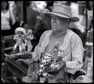
In the photograph of the salesman to the right, we can actually see an expression. Even though the expression might seem different to everyone it gives an incite to his character, mood and personality. His wrinkles show a true honesty instead of being idealistic. Photography causes the viewer to question it, wanting to know more; unlike a painting where the artist shows you what to see.

People who don't like their photos taken don't usually hide from the camera because they hate the camera. They usually fear not looking their best. To the left, this photographic portrait seems staged. She's very photogenic, but does the subject look like that in real life? When a German photographer experimented with altering photos, photographs became much more popular, because then everyone could look their best. We are so used to seeing photographs, very few question it's honest reality. Now, frequently the time, they are altered in some way to enhance the overall quality. Being physically idealistic has been taken to a whole new level.
Reality is just a harsh way of saying 'it is what it is, and always will be.' Art is a lighter way of showing the artist's reality. Photographs are honest expressions of reality for only a split second in time. Photographic Art...I'll let you decide.
Monday, February 23, 2009
Just Another "Throw Of The Dice"
The lecture given on February 23rd covered the early 20th century of graphic design. Synthetic Cubism was simplified forms of graphic essence, such as the work of the famous Picasso. Seven-Second-Medium was a term used to catch the eye of traveling pedestrians. Around this time when the worlds broke out artist began to use propaganda. The most famous and well known of these posters and art is the Uncle Sam pointing "I Want You." On the the greatest movements was the Dada Movement. Consisting mainly of poets and writers the Dada's purpose was the eliminate the sensible with absurd non-sense. The Dada's declared no style, as they were against it. They also participated in destructive activities to draw attention to their purpose or cause. It is also said that they invented the photomontage, which is found images that are rearranged.
I wonder how Man Ray created his 'rayograms' since nowadays its expensive to get an x-ray. I found this part of the lecture the most interesting. It causes me to wonder what I can do with x-ray film since my father works in radiology. Not that I could get him to sneak me in to work on the million dollar or so machines. I don't know if they use the turn anymore but I still think the Seven-Second-Medium applys to us nowadays. Now there is a relatively new system of advertising as companies have put them on wheels. You may spot a truck or two between Sarasota and Tampa with rotating ads on them. This kind of advertising creates a whole new way of advertising as companies must get their profession and phone number across to the viewer, minimum. I always tell my mom about a new fashion trend that take place and she just tell me, "No, it just a comeback." Well, the say goes for art as well. It usually always started somewhere.
I wonder how Man Ray created his 'rayograms' since nowadays its expensive to get an x-ray. I found this part of the lecture the most interesting. It causes me to wonder what I can do with x-ray film since my father works in radiology. Not that I could get him to sneak me in to work on the million dollar or so machines. I don't know if they use the turn anymore but I still think the Seven-Second-Medium applys to us nowadays. Now there is a relatively new system of advertising as companies have put them on wheels. You may spot a truck or two between Sarasota and Tampa with rotating ads on them. This kind of advertising creates a whole new way of advertising as companies must get their profession and phone number across to the viewer, minimum. I always tell my mom about a new fashion trend that take place and she just tell me, "No, it just a comeback." Well, the say goes for art as well. It usually always started somewhere.
Monday, February 9, 2009
"To Each Age It's Art, To Art It's Freedom"
February 9th lecture focused on the Art Nouveau period. Even though the art influence only had a 20 year life span, artist contributed quite a bit in to this period. New forms were invented and ornamentation became structural. Visually the art is linear with textural and color areas. The concept made the art appear apart of everyday life. In the beginning the art seemed rather unusual having a fantasy like quality and was often used as poetic imagery. Women were often used in the art which created a motif creating an idealized beauty. Artists expanted their abilities by limited the art visually. One style was the 'Coloring Book Style' which consisted of thick, black outlines which totally completed the form.
Later artist decided to challenge the mind of viewers creating flat color and sharp silhouettes, allowing the viewer to mentally complete the imagery or story themselves. Backgrounds were later eliminated so the viewer could focus on the neccesary points. A major movement of this time period was the Jugendstil movement. Jugen meaning youth, and stil meaning movement. This movement took fantasy a step further by using non-traditional forms to stress commodity, culture, and alientation. The Secession movement was a clash between traditional and new ideas. Art Nouveau didn't stop there however. Artist broke away from floral patterns creating mathamatical patterns using geometric shapes.
For such a short time period, Art Nouveau influenced a great deal of artists. I haven't quite decided yet how I feel about the art. I'm mixed between liking it and hating it. I believe I'm more fond of the visually constricted art. The pieces that let the eye and mind complete the image for itself. I believe that is a major leap for design because each viewer has their own interpretation. In another class I have someone can have a different personal interpretation than another based on their experience. I've never been good with geometry but it seems the world continues to try to make sense of the world though patterns. Like the continuous spiral that never seems to end and goes on forever. Artist will always try to touch the world with their new discoveries. Discoveries aren't something that should be kept but shared.
Monday, February 2, 2009
"Designers Touch Everything"
Interesting points that caught my attention in class was the birth of Mass Communication. Beginning in the 1700's communication seemed to be more about art form more than news itself. Fat face and style type introduced themes to design, creating an atmospheric mood with just letter forms themselves. The boxy type style of fonts, San Serifs, were introduced by William Calson in England, 1816. Larger scale lettering became overly competitive for visual impact. In the 1800's the first photograph was printed in media using emulations. The Victorian period brought about the dawn of the Art of Persuasion. A major key element in this lecture was chromolithography, which was a technique to massively produce print in color. This brought about product packaging. Something that interested me the most was the creator of seasonal greeting cards, Louis Prang.
It seems that everything in this lecture leaded to the birth of everything that I know well today. Even though I believe that greeting cards have become somewhat unnecessarily abundant, you can find thousands of designs on store shelves today. It amazes me how long something continues to have an impact on society today. I'm sure the Harper Brothers, who created the first people magazine, had information that was actually useful to the people instead of some of the celebrity gossip where the front cover bears two different stories and the magazines sit on the same self. The lecture today still helped me understand a great deal of where the 'original' ideas came from and helped me appreciate the brilliant ideas that brought us to become the designers we are today.
It seems that everything in this lecture leaded to the birth of everything that I know well today. Even though I believe that greeting cards have become somewhat unnecessarily abundant, you can find thousands of designs on store shelves today. It amazes me how long something continues to have an impact on society today. I'm sure the Harper Brothers, who created the first people magazine, had information that was actually useful to the people instead of some of the celebrity gossip where the front cover bears two different stories and the magazines sit on the same self. The lecture today still helped me understand a great deal of where the 'original' ideas came from and helped me appreciate the brilliant ideas that brought us to become the designers we are today.
Monday, January 26, 2009
Evolution of Writing Communication
Written communication started as far back as 200,000 BC with pictorial writings on cave walls and has evolved dramatically since. It has been adopted and changed for thousands of years simplifying its function more every time. When alphabets began to appear there was no specific organization. Over the centuries, different cultures developed mathematical ways of portraying written communication, even establishing 'rules' for writing and reading. Phoenicians invented a 22 simple alphabet system of signs. The direction in which to read was established by the Greeks. Celtic books began to use spacing in between words and and illustrations with word text for those who were illiterate. Written communication has a major impact even still today. And to think I used to hate to read. Written enables people to communicate in a vast way. It allows use to say something important to hundreds, even thousands, of people without vocally saying a single word.
Subscribe to:
Posts (Atom)